Pučko
UX/UI design,
Brand refresh

The Client
Pučko is a Slovenian manufacturer with more than 100 years of experience in concrete products. They serve municipalities and businesses that build public spaces, as well as homeowners who want to improve their space. They also deliver bulk concrete across Slovenia.
The Challenge & The Goal
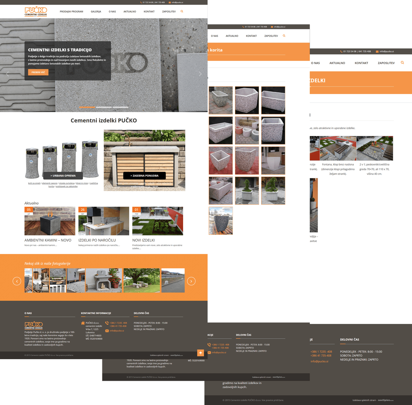
The current website really didn’t match the company’s reputation. It felt stuck in the 90s, its categories were hard to follow, product pages were thin, and the path to contact was not that obvious. The visitors struggled to find the right product they wanted and many left before reaching out to the company.
So the goal was clear: help people find a product quickly, send an inquiry without friction, and present the brand as trustworthy and professional.
Before & After

The Approach
So how was this all approached? I led the redesign (with huge help from my project lead) end to end: information architecture, UX, UI, and build. I also created supporting marketing materials like brochures, catalogs, banners, and Instagram posts. My colleagues at DreamFx handled all 3D assets and renders, keeping the product visuals consistent and faithful to the real thing.
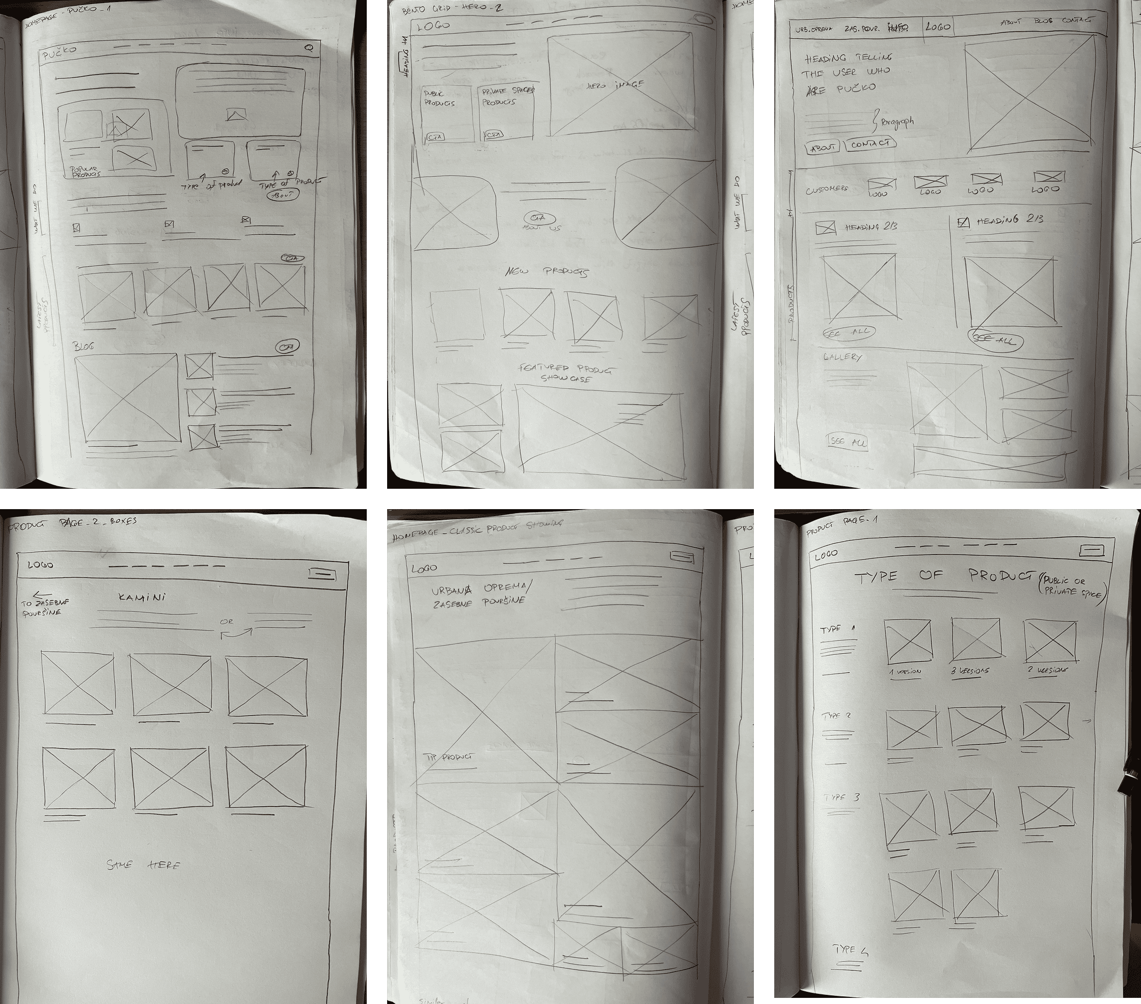
I started with fast wireframes, tested them internally across several iterations, and visited Pučko to understand how the team explains the catalog in real conversations. I reviewed competitors to learn what actually helps people choose. We had a four-month runway from kickoff to launch, which pushed us to stay sharp and move fast on decisions.
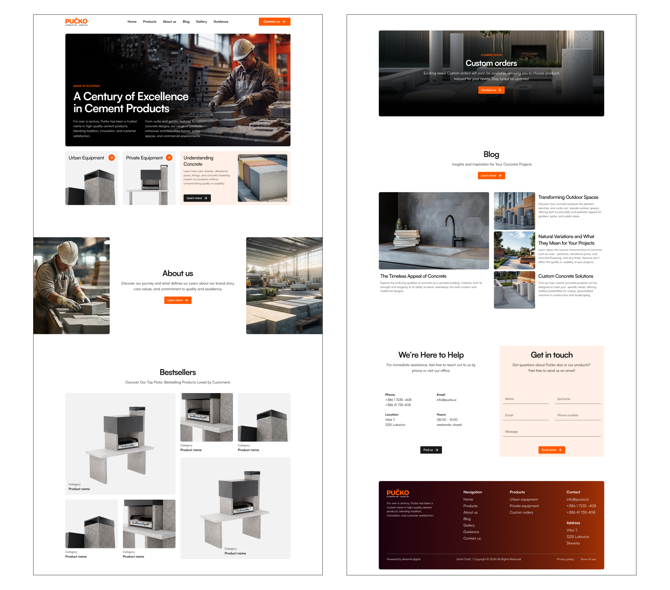
On the images below are shown the first wireframes and the first styled concept for the homepage. We had a long way to go!
The Solution
Homepage that guides
The homepage opens with who Pučko is and what they make, then moves into featured products/bestsellers. New visitors get a strong first impression and an easy starting point.
Clear structure
I reorganized the catalog into intuitive categories, each with its own page. Navigation is simple and consistent, so the users will always know where they are and what comes next. This is achieved with a breadcrumb menu.

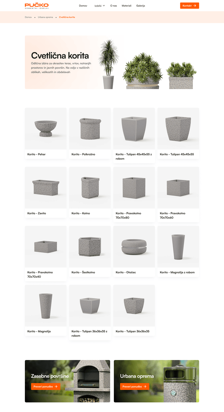
Product pages that help users find what they need faster
Each product page shows clean visuals, key specs, and straightforward options. Where relevant, users can select a material variant and faucet. Those selections pass directly into the contact form, so the form is already filled with context. No re-typing required.
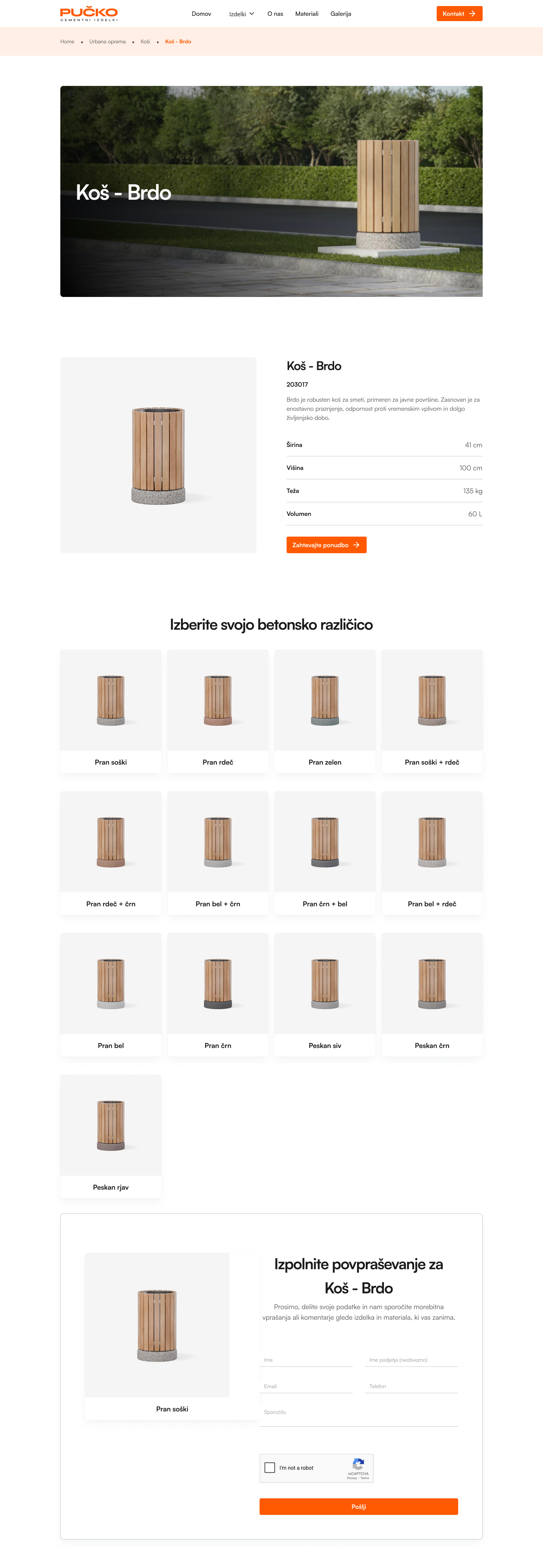
Visual system that earns trust
I kept the visual language strict and readable. The orange (#FF5A01) respects Pučko’s legacy color but works better on modern screens. The typography is consistent across cards, tables, and forms. We used high-quality 3D renders to show products clearly without heavy photo dependencies.
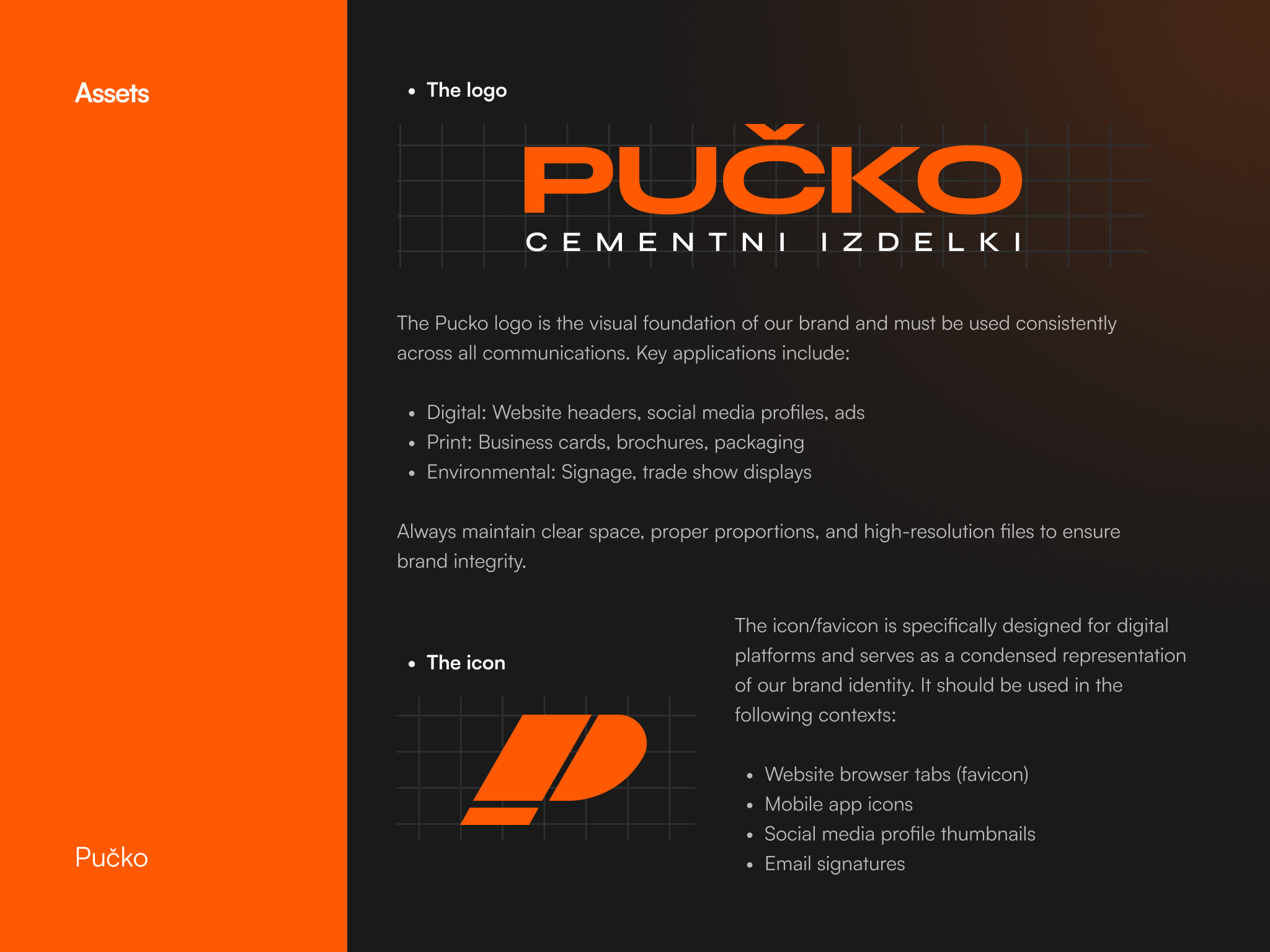

Built to scale
I built the site in Webflow with multiple CMS collections. There are currently 140 products, all of them with several color variants. The structure is organized so adding or editing products is straightforward.

Results
So now about 2 months after launch inquiries have increased by about 150%. The team now sees 20+ inquiries per week, up from 5-6. Roughly one in four inquiries becomes an order.
Early signals improved as well: time to first contact click dropped and bounce rate decreased. The team at Pučko also reports fewer “where do I find…” questions from customers. 10+ people were sent a short survey for the new web experience and, the website recieved 95%
Highlights Worth Noting
We dedicated a space on the website to the summer-kitchen projects that the company manufactures because the company values that service and the old site buried it. A concise “Why Pučko” row near key points in the journey surfaces trust signals like tradition, quality, delivery, and support. The contact form is simple and respects the choices users already made on the page.
What’s Next
We’re planning a configuration experience for custom setups. An English version of the site is also on the roadmap, together with new product lines as they come online. Also the social media overhaul is on it's way, 9 social media posts have been designed.
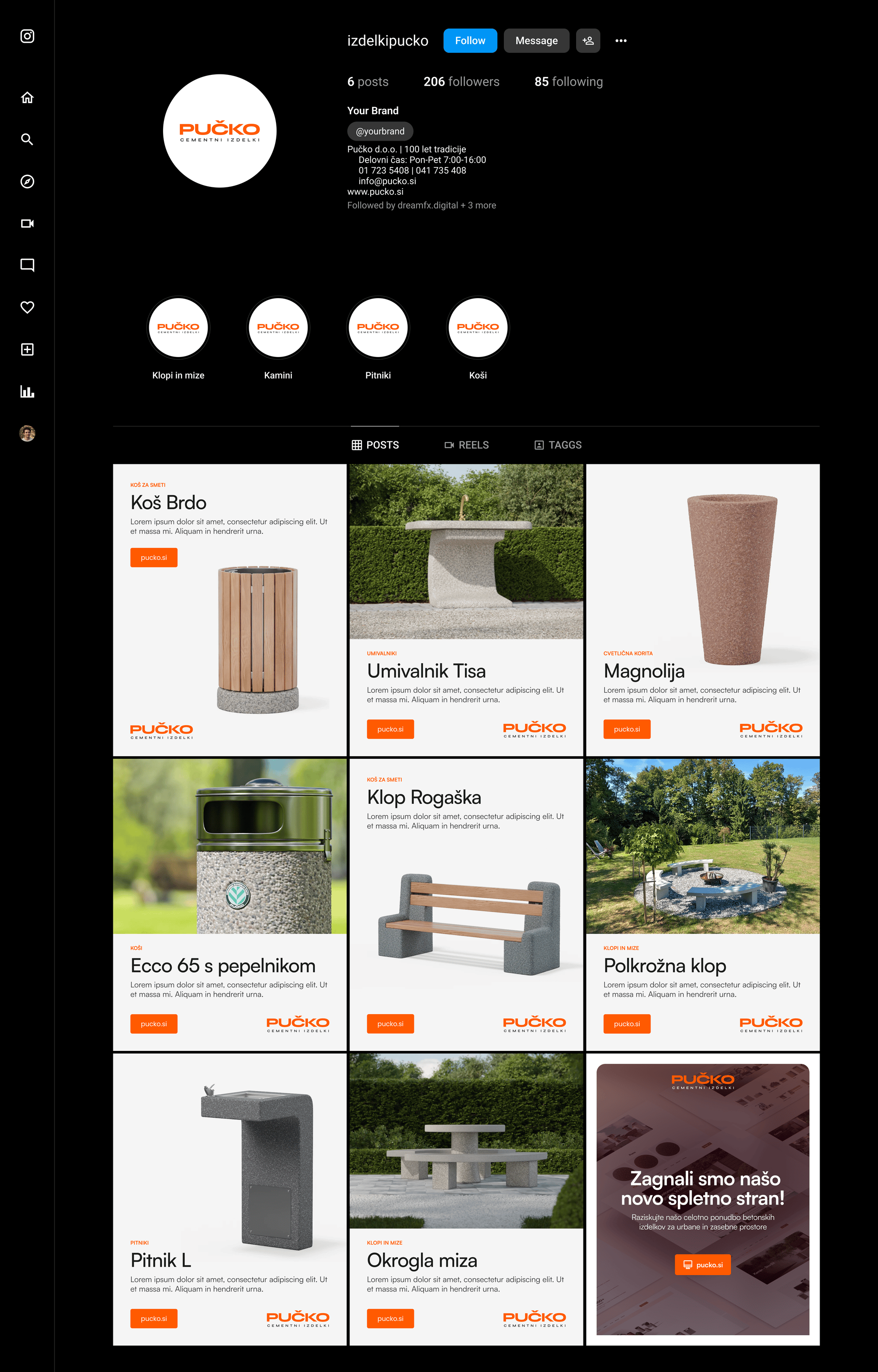
Homepage


