Darth Craft
UX/UI design,
Social media materials

The Client
Darth Craft creates compact watercraft for kids that are safe, customizable, and most importantly fun. The brand aims to give families a simple way to explore the water. The website’s role was to show that clearly and make it easy to get in touch or become a reseller for the products.

The Challenge
The branding (logo & colors) were already set before I joined the project. The project time and budget were tight, so every section had to earn its place on the website. The time for primary research was limited as well.
DreamFX, the studio I work at, has 3D artists who handled the modeling and rendering for Darth Craft. That was a huge plus and time saver. Those renders replaced traditional product photography, speeding up updates and keeping visuals consistent without repeated shoots.
The goal was pretty simple: help visitors understand the lineup, preview customization, and contact the team without many hurdles. All in all the client needed a site that presented the models clearly, explained the value, and encouraged visitors to reach out.
The Approach
I used Relume kits to build wireframes section by section, keeping only what each page needed. The process of choosing what to include and how to style it was challenging but really rewarding because the client was really responsive, and trusted based on the design thinking mindset applied by me and the team to come up with the best solution possible. There were many iterations, as shown on the image below.

It served as the foundation for the final homepage, which was designed to highlight the models first, build trust through key brand messages, and guide visitors toward clear actions like “Request quote” and “Find a dealer.
The Solution
Homepage
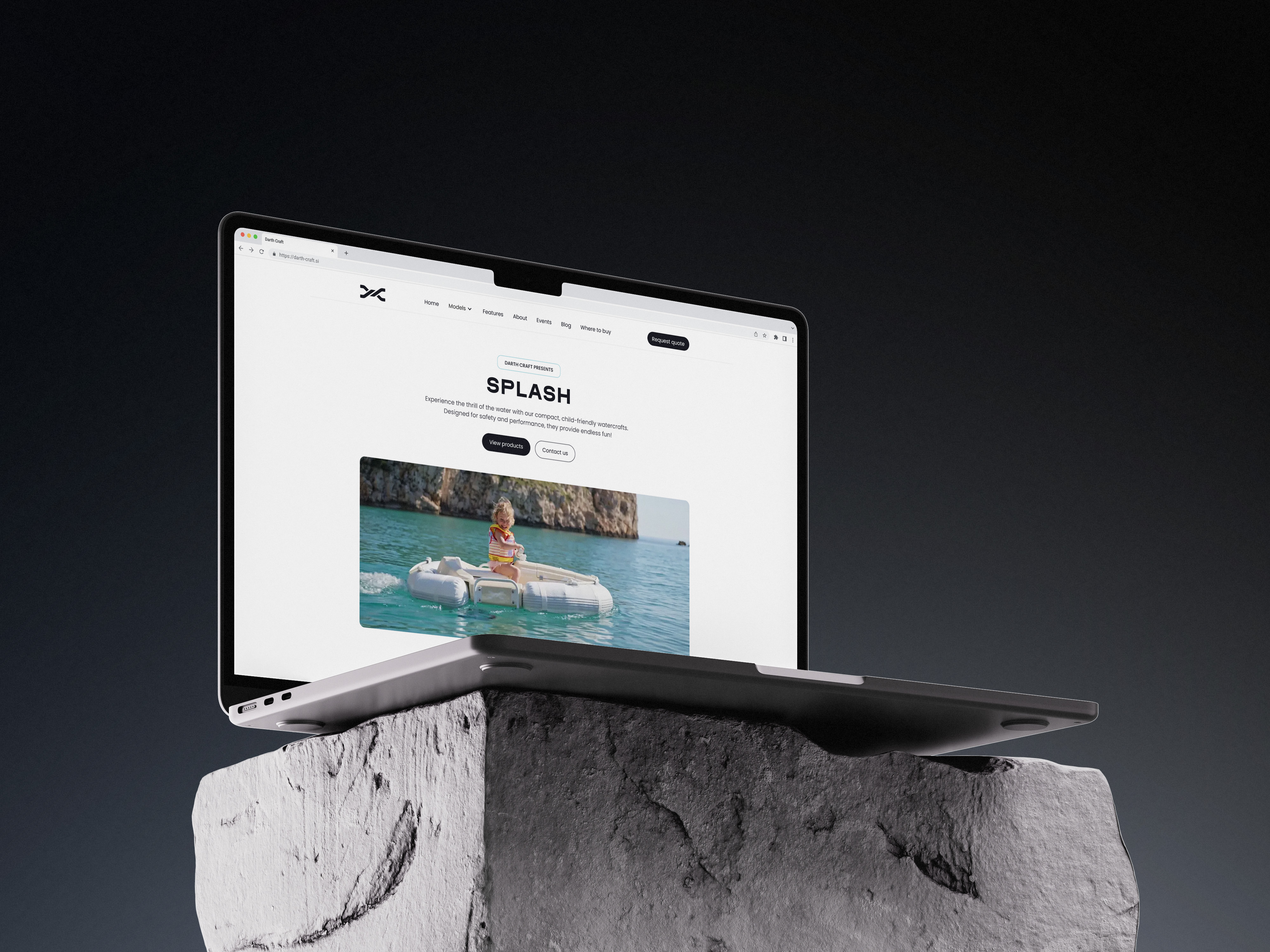
Navigation matches how people browse: Models, Features, About, Events, Blog, Where to buy, Contact. Each page keeps a steady rhythm, clean visuals, focused copy and clear next steps.
The homepage (image 1) guides the user: From story to models to features and events, the page moves people toward a quote or a dealer. It’s energetic without being noisy (it was important to the client and us the website to be clear of clutter and unnecessary decor.
Product pages
Product pages (image 2) pair strong visuals with specs and direct contact paths. We added a lightweight color/sticker selector with custom Webflow code. It shows personalization right on the page and became the starting point for a fuller configurator UI now in development. Users can preview sticker colors instantly right now. It proves the idea and respects the constraints.


Designed to convert
Primary CTAs appear where they matter. The dealer page invites new partners and sets expectations for next steps.
Social media posts
Beyond the site, I designed marketing and social posts so the message stayed consistent across channels. These assets are still under review and are internal design documents as of now so I unfortunately can't share them here. This helped ensure that the online experience, whether on the website or Instagram, felt cohesive and recognizable.
Results
What’s Next
For the next few months the plan is to ship a new configurator UI for a richer, faster selection experience, and pure awesomeness :) (a little sneak peak below).
Also the plan is to expand the resellers and add new watercraft models. Also the site is already available in Polish language as well. The site is maintained in Webflow with scaleability in mind to accomodate new models and the new configurator.

Homepage


