Ohrid Volunteer
UX/UI design,
UX Research
What is Ohrid Volunteer?
Ohrid Volunteer is a mobile app I created for the close-knit community of Ohrid. It’s a simple way for local organizers, whether they’re individuals or organizations, to post volunteering opportunities and for volunteers to find ways to lend a hand. The app was designed with small communities in mind with intention to bring people together and to support and grow their volunteering community
Background & Motivation
In the summer of 2024, wildfires hit Galichica Mountain. Locals were eager to help, but everything was chaotic. For example, info was scattered, mostly via Facebook or a single phone number. This lack of structure inspired me to design a platform that supports and organizes volunteer efforts for small communities like mine.
Problem & Goals
There was no central platform for organizing or discovering local volunteer opportunities.
The goal was to strike a balance:
Help volunteers find opportunities that matter to them and feel good about making a difference in their community. Make it easy for organizers to set up events and connect with volunteers.
The Solution
For the volunteers
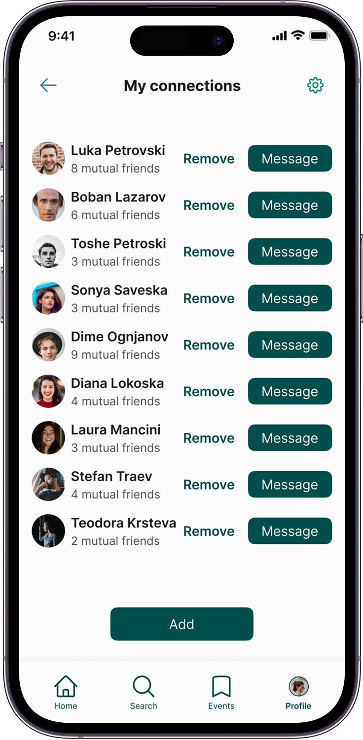
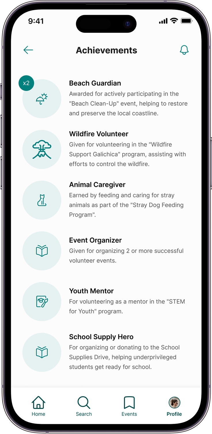
Volunteers can browse events that fit their skills or interests, from beginner-friendly activities to specific causes they care about. The goal is to make volunteering enjoyable and rewarding.After each session, they earn small rewards that recognize their efforts. The app also makes it easy to connect with others. Volunteers can add and chat with people they’ve worked with, keeping the sense of community alive.


For the organizers
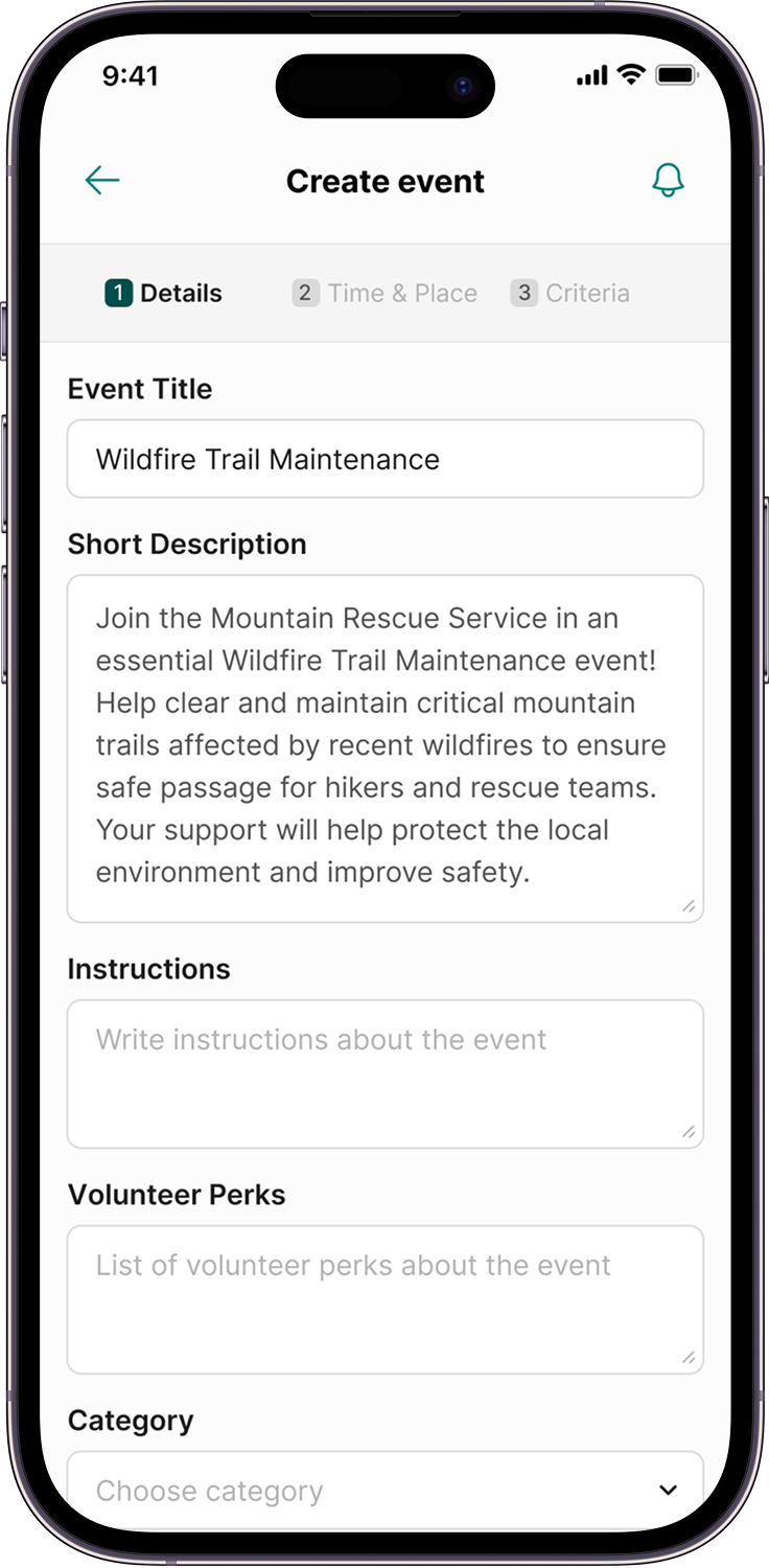
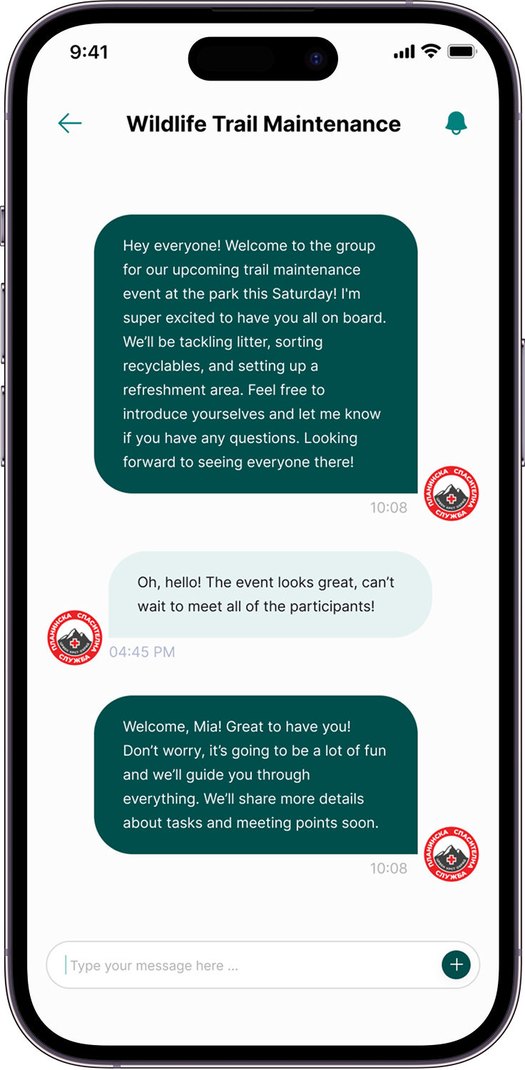
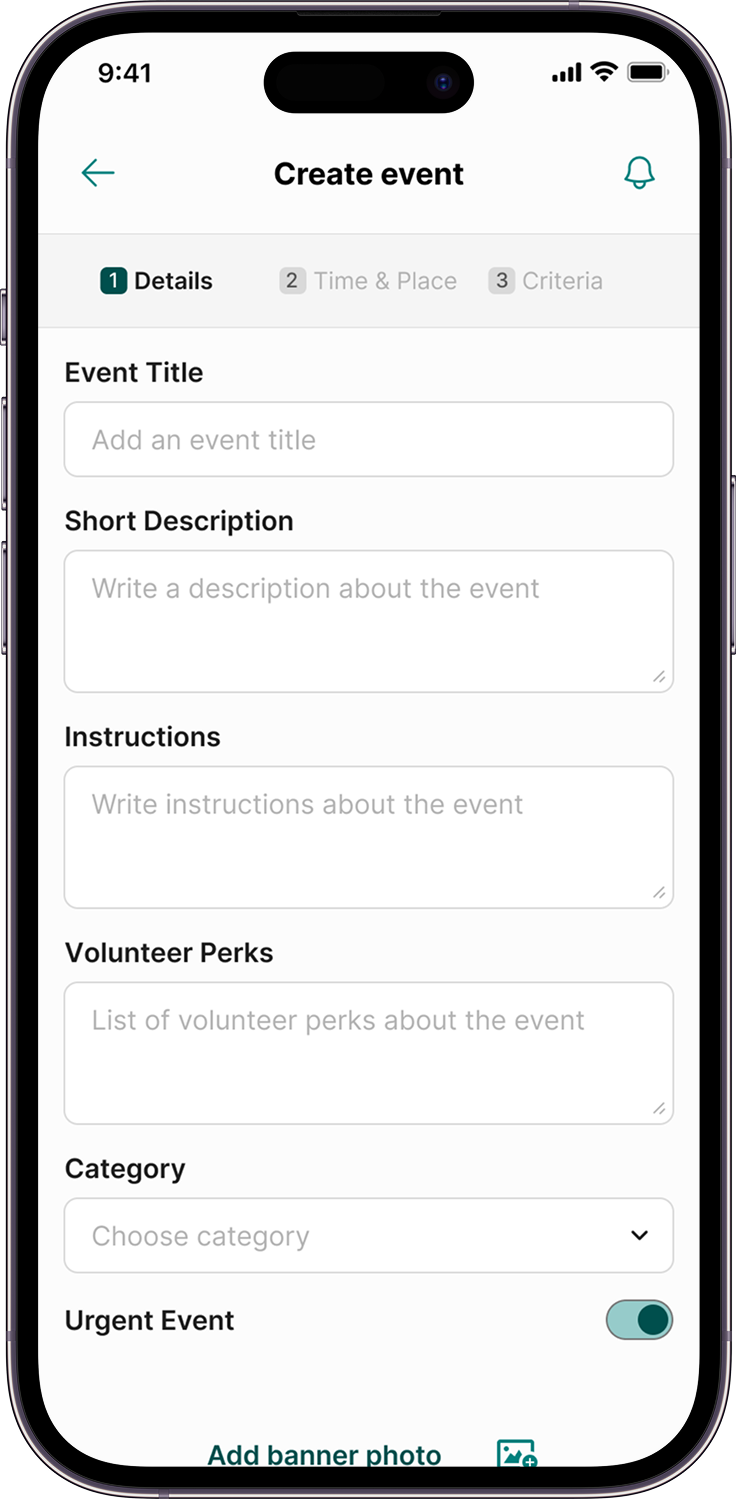
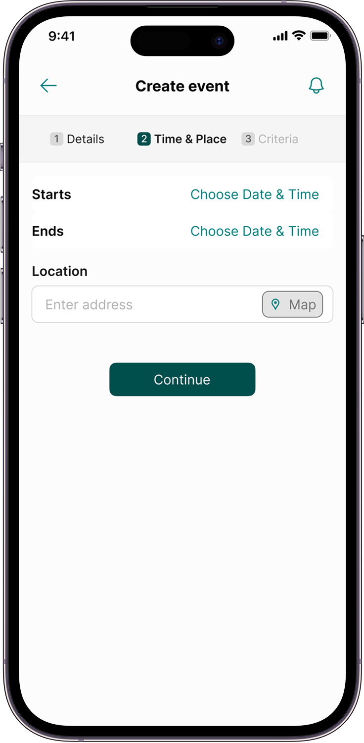
The app makes event setup simple, guiding organizers through all the key details so nothing gets missed. Organizers can quickly set up events and communicate key information to volunteers. A built-in messaging feature helps them stay in touch, answer questions, and keep everyone updated.

Users & Research
I interviewed 7 participants and mapped their responses into 3 main user groups:
1. Community Organizers
Need: simple event creation and easy volunteer coordination
Pain: hard to recruit dependable volunteers, unclear communication
2. Tech-Savvy Volunteers
Need: personalized events, intuitive UX
Pain: clunky platforms, poor filtering, limited time
3. Helpers With Low Tech Confidence
Need: easy onboarding, clear instructions
Pain: overwhelmed by tech, no guidance
Ideation
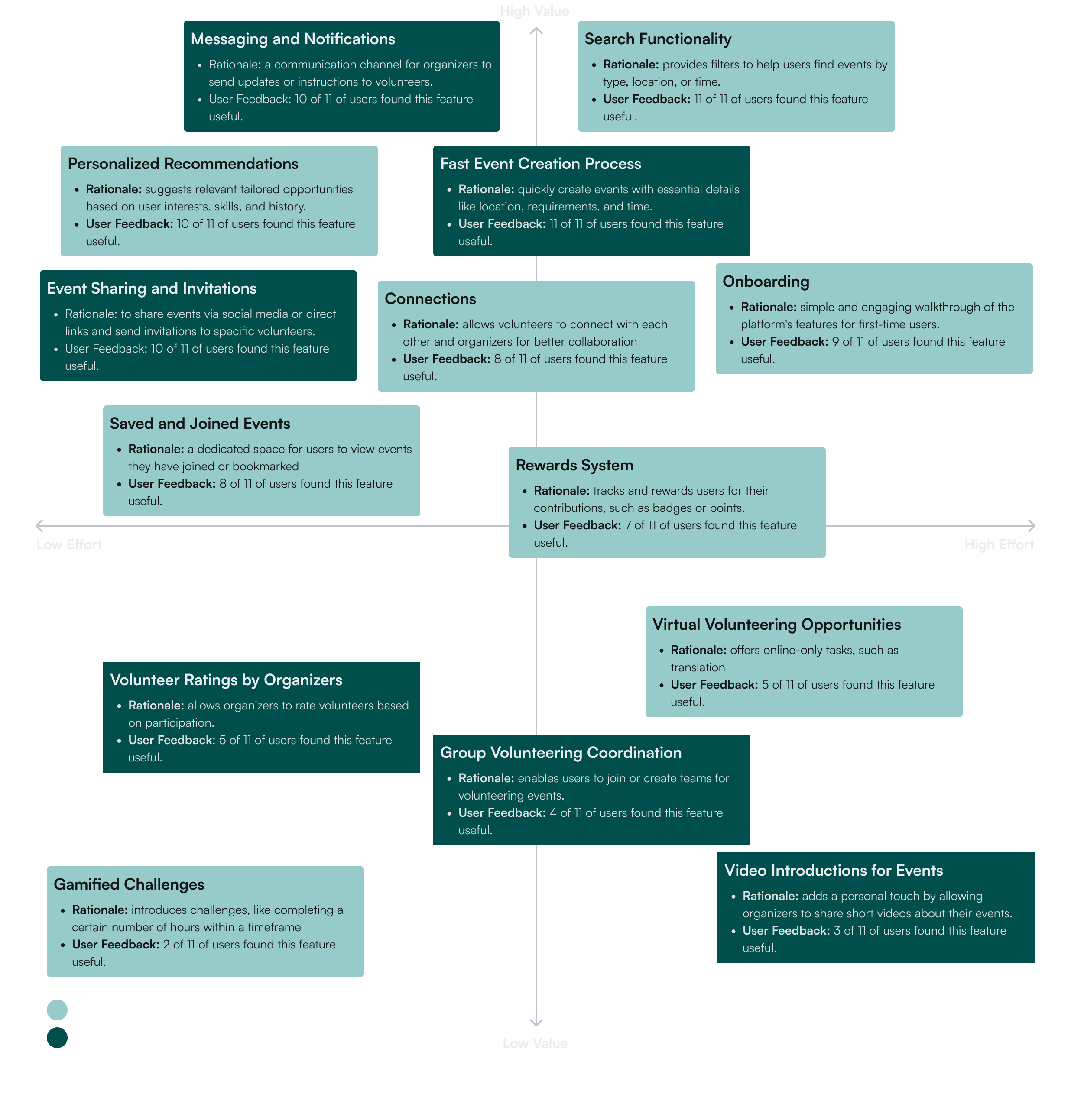
To determine which features would be most valuable, I conducted research through a survey with potential users to evaluate their needs. Eleven participants, selected for their similarities to our user groups, provided insights that informed which features to include. The suggested features were then put onto a prioritization matrix along with the rationale and user feedback for each.
Designing
After finishing the Ideation phase, I moved on to the design phase. The goal was to keep things simple and to focus on the most important features I found during ideation and presenting them in a way that’s clear and easy for users, without creating visual or mental overload.
User flow for volunteers
The user flow for volunteers was done to visualize how the user of every background will move through the app whilst searching for, joining or saving an event, as well as viewing those events in a list.

User flow for organizers
The user flow for organizers was done specifically to visualize the main event creation process and subsequent event preview screen interaction. It also helped me clarify how the system links to and displays the published events.

Paper wireframes
I started the visual design process by sketching hand-drawn wireframes to define the basic structure of the homepage. These wireframes focus on the basic layout and features to include in the bottom and top nav. I also experimented with different designs for cards, tab filters, and buttons

Notable iterations in the designs
During the two rounds of the usability tests I iterated on key screens in the app based on user feedback. That helped me refine the design, addressing pain points and improving usability.
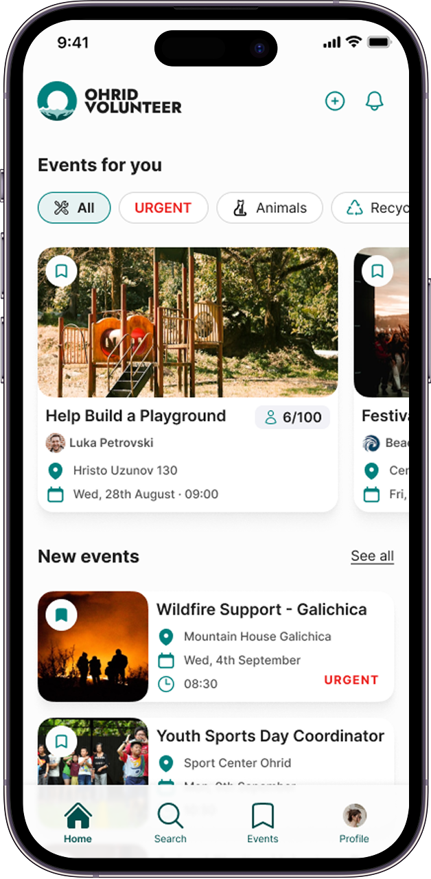
Homepage iterations
For the homepage, the main changes were focused on improving accessibility and highlighting urgent events to appear before other filter tabs. I made revisions of the bottom navigation to make it more user-friendly and easier to access key features.


Event creation iterations
During usability testing, I noticed that users found the original event creation form (image 1)overwhelming because everything was on one long page. By dividing the form into smaller, logical steps (chunking), the new design simplifies the experience, allowing users to concentrate on one task at a time. (images 2 and 3)


Profile iterations
Users mentioned that their profiles felt a bit shallow, with only skills and interests visible. They wanted more depth and recognition for their efforts.


Visual branding
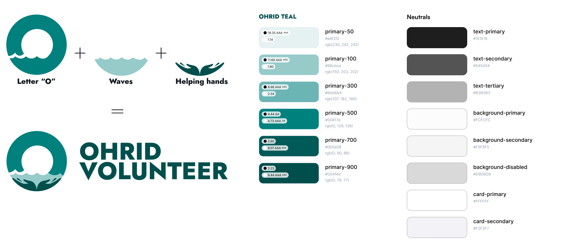
I chose teal as the primary accent color to reflect the community spirit and the beauty of Ohrid. Teal combines blue, representing the city, and green, which connects to environmental efforts often tied to volunteering.
For the logo I used the shades of the primary brand colors in the creation of a custom mark. It blends the waves from the Ohrid Lake with helping hands(a symbol for volunteerism) and of course the letter “O” for Ohrid. For the logo typeface, I chose Jost Extrabold, a bold and modern typeface that stands out while keeping the design grounded and sleek.
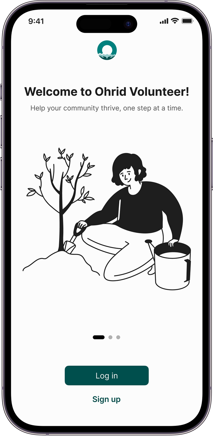
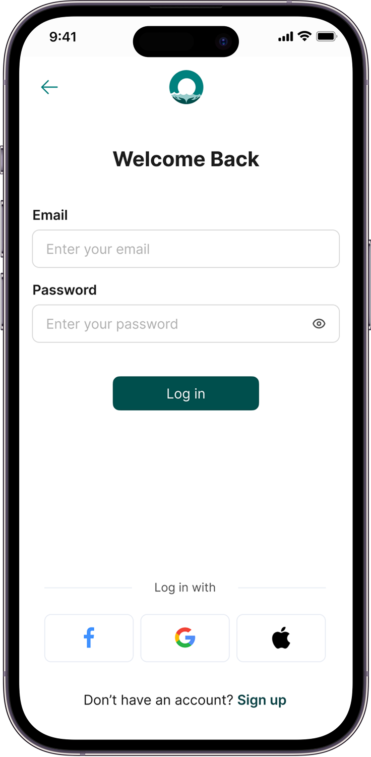
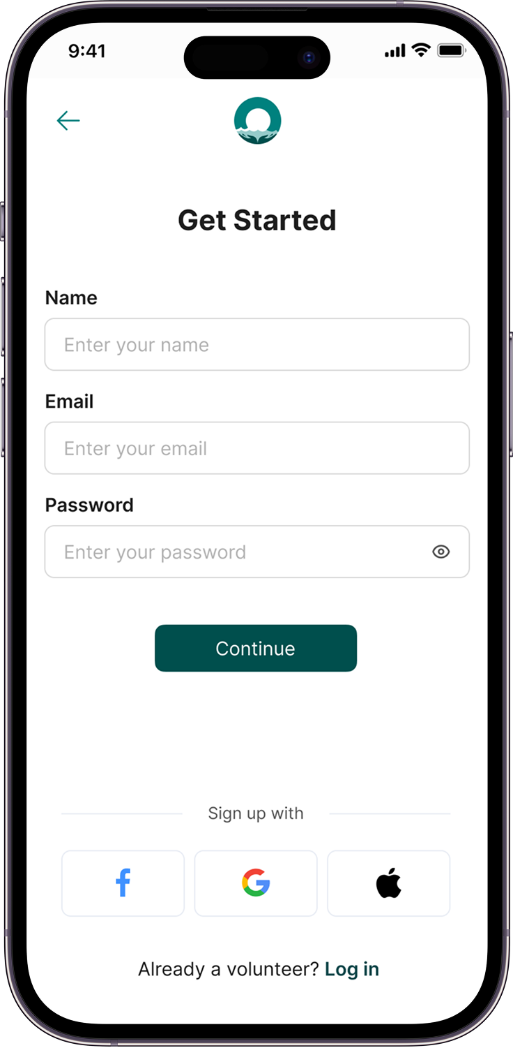
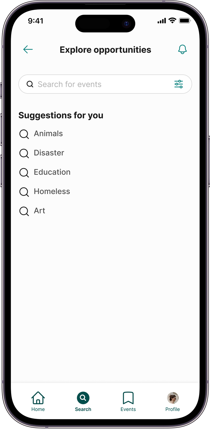
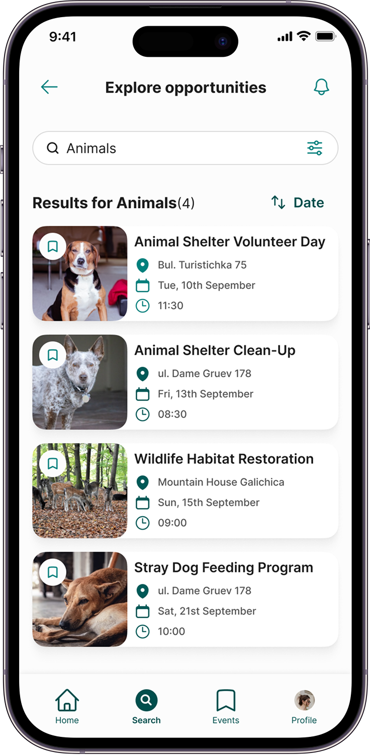
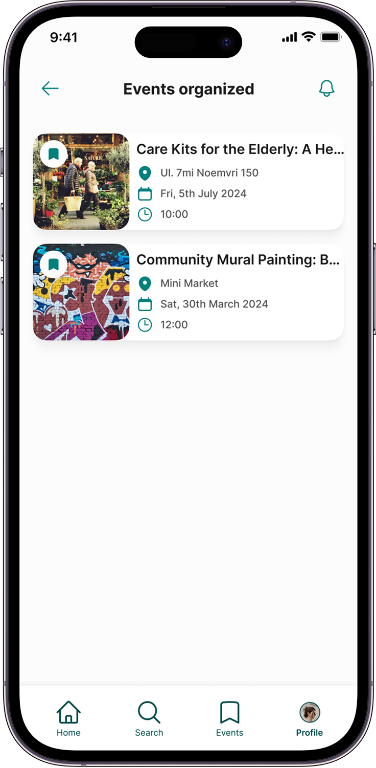
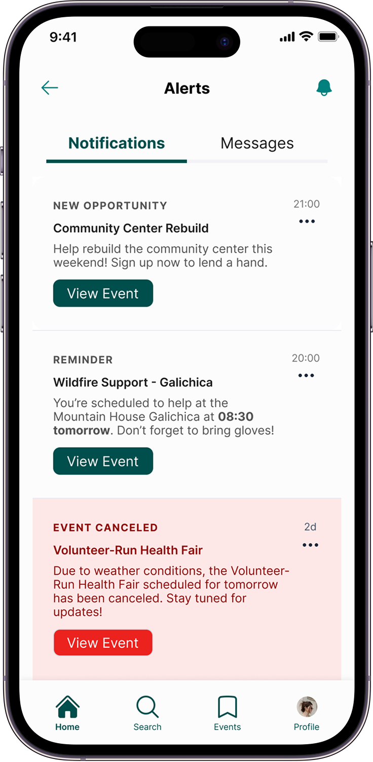
Final UI











Learnings
Working on this app has been an opportunity to grow as a designer and deepen my understanding of designing for the greater good. Involving my community in the process showed me how design can bring real value to people’s lives. I also focused more on the UI side of things.
I aimed to create creating a clean, modern UI that felt legible, minimal but still approachable and accessible to the vast majority of the userbase. Another big takeaway was learning how to structure my time more effectively. I stuck to a clear schedule and organization of my tasks was key. I stuck to a clear workflow which in turn helped me stay focused and move forward without getting overwhelmed.
What’s Next
I’d love to explore how Ohrid Volunteer could work as a web platform. A web version would give event organizers more space to manage events and keep track of volunteers. It could even include tools like scheduling or event summaries to make their job smoother. Also I think less-tech savvy volunteers that don’t use apps much would appreciate the web version.
I also want to test the app with more people in the community. Getting real feedback would help fine-tune the design and make sure it’s as useful as possible for everyone who wants to get involved.
And I really hope further down the line maybe a developer will get involved in this project to make it a reality.


